EDU | 10 Most Useful Lightroom Tools
Yes! Welcome!
I swear I enjoy the nerdiest things and I never realized it. Our first educational blog post was all about organizational applications and now we’re diving into Lightroom! I freaking love Lightroom and I get a real kick out of teaching it. I never knew how confusing this software is to some people and I’m ready to help!
I first learned Lightroom when in graduate school! I think that’s why I love it… I learned this program inside an out! I was required to. There were tests. But because of that intensive process, I feel super confident working my way through the program and editing with ease.
Shortcuts! They’re necessary. If we want to get real with it, photographers can easily suffer from carpal tunnel. So the less hand movements, the better. These editing tools and keyboard shortcuts have made my life far easier, and my editing workflow cleaner and faster.
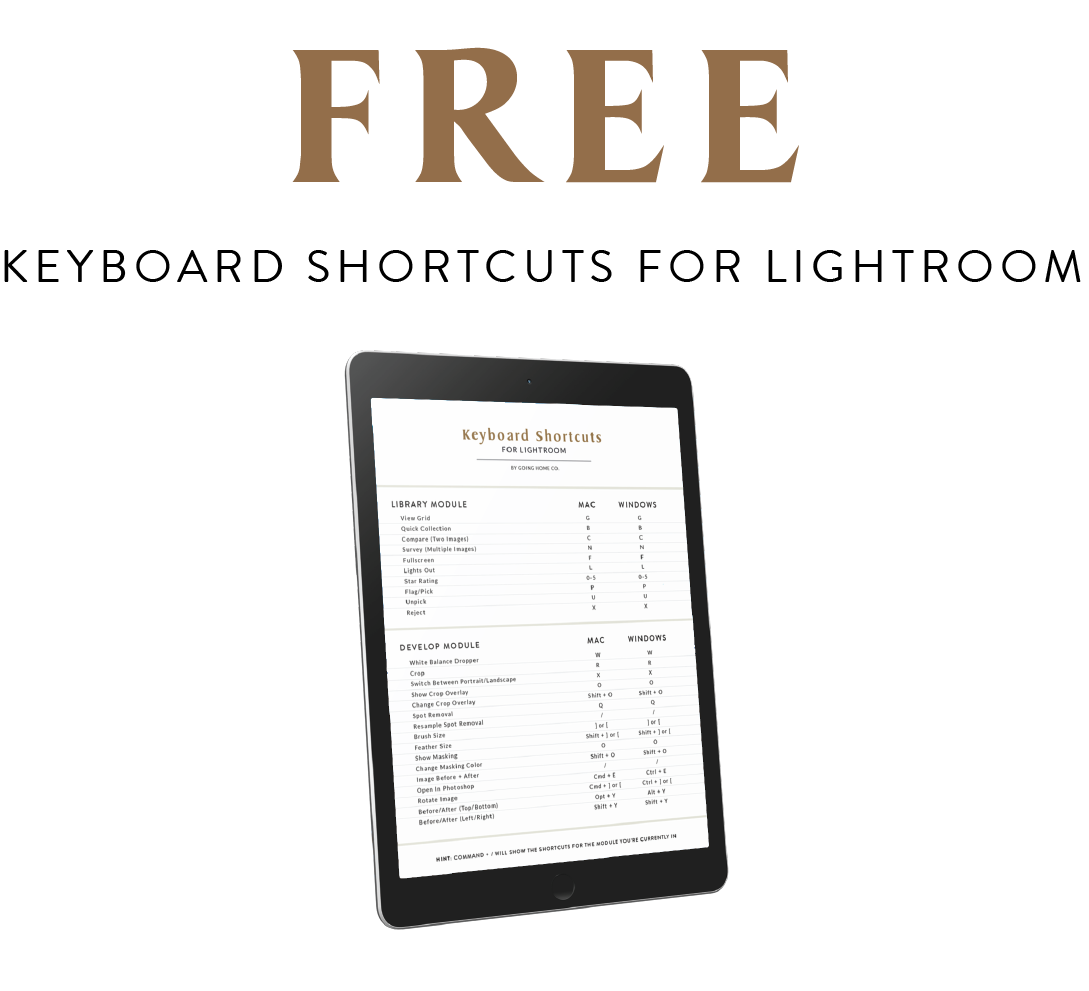
This blog post will go over my 10 most used tools and shortcuts! I’ll try my best to focus on shortcuts that are not typically discussed, but I went ahead and made a FREE DOWNLOADABLE KEYBOARD SHORTCUT GUIDE with a whole long list of the most common keyboard shortcuts! Yup, yup! Grab that free download at the bottom of the page, but don’t forget to read and jot down some notes about my top 10 most used Lightroom shortcuts! These are not all keyboard shortcuts so don’t overlook the list below. Let’s get into it!
My most used Lightroom shortcuts!
In order of awesomeness.
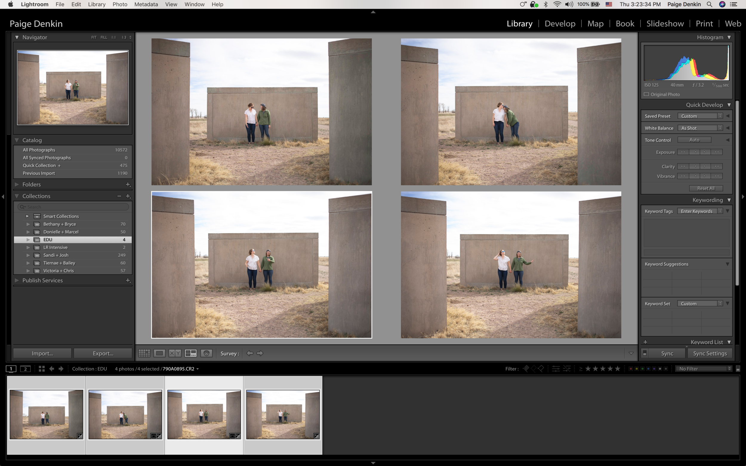
No. 10 Library / Develop
Without a doubt, my most used modules in Lightroom. I’m constantly switching back and forth between these two sections and instead of moving throughout the program and constantly clicking Library or Develop and then tracking down the image I’m looking to work on, I can click between the two with some easy keyboard shortcuts.
Library - G
Develop - D
(both Mac and Windows)
When you’re scrolling through your library and you come across an image you really love and you need to edit it right meow, just click “D” and it will immediately take you to the Develop module. The image you were looking at will be the image currently active in the Develop module, ready for edits. And then back to your full library? Press G! I remember it as D for developing and G for the grid.
No. 09 Compare / Before + After
I am constantly looking at my before and afters, or comparing one set of images to another set of images. This is for many reasons, maybe I want to see a bunch of images next to each other to ensure a consistent look throughout the session, even with changing light and settings. Or perhaps I have two very similar images and I’m not positive which I like more and which to include in a gallery… I can see them side by side and make better decisions that way.
Before And After - /
(Mac and Windows. When in the Develop module)
Compare - N
(Mac and Windows - Works in Develop or Library, but always opens in the Library)
Two files selected and compared it the “N” key.
No. 08 - Sync
Syncing while editing is probably the most commonly used tool to create consistency in work! It’s a simple concept, but there’s elements you should and should not be syncing from one image to the next. I use it for every session I’m editing, but I frequently find myself realizing I batch edited images with edits that don’t work from one photo to the next! So let’s break down the sync options!
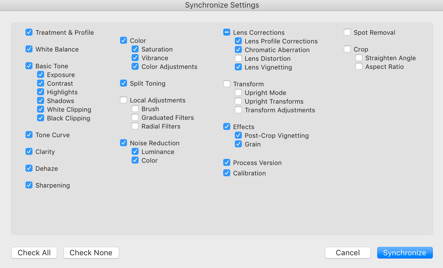
To start, I take my time when editing our images. I rarely batch edit more than a dozen images at a time, and when my images clearly are changing settings or lighting, I only sync one photo from the last scenario to the new scenario, make the tweaks I need for the new scenario, and then keep syncing. All our presets require basic changes (NO PRESET IS A MAGIC WAND) so instead of taking the time to drop a preset and make all those necessary changes, I’ll usually look for images that already have similar edits to the ones I’m currently working on, and then sync from that.
Example! Say the first look was outside. Edited them, they look great. The blues in the suit look rad. The colors in the bouquet are accurate and the skin tones are natural. I had to bring down the highlights a bunch due to the harsh sun outside, but the image looks awesome. Moving on, we did portraits inside. I sync the outside shots to the inside shots. That helps me keep some of the characteristics I edited before like the blues, the skin tones, etc. But now it’s darker in the room and the last images were made even darker to balance out the harsh sun. These indoor portraits are going to need to be edited to fix the exposure, but the color characteristics (tone, saturation, luminance) should still be accurate! Next we started walking to the ceremony location, so back outside. I’m not going to synch those indoor portrait shots with the walking to the ceremony shots. Instead, I’ll grab one of the outdoor first look images and use that to sync with the current images. Does that make sense? That method helps me keep the momentum up and eventually I have enough examples to sync with that I can easily edit any scenario!
Take your time to review all the syncing options before moving forward. Sometimes options like “transform” or “spot removal” are highlighted and they’ll add adjustments from one image to the next and they might not make sense. If you took multiple images of the exact same thing (locked off tripod shots), then sometimes syncing those can prove beneficial.
Hint: Syncing in the Library module will help you share keywords easily!
No. 07 - Sliders Made Easy!
I find it super odd that every tutorial or class I’ve gone to or participated in, there’s only one suggestion of how to easily control your sliders. Well I have two more for you! The common answer is to simply drag open your editing panel to make the sliders longer and easier to control when going left to right. Relatively simple, but that still involves clicking and dragging that little tiny slider bar. It’s impossible to make the perfect micro adjustments. But I have two methods that well help you get the exact edit you’re looking for!
Least Favorite: Click & Drag the slider. Drag open your editing panel for a longer slider. Okay for large adjustments.
Kinda Sorta Favorite: Click & Drag the number! Exact same motion, click and drag left and right, but you click on the number instead of the tiny little slider bar. This allows you some better control when you’re making big adjustments.
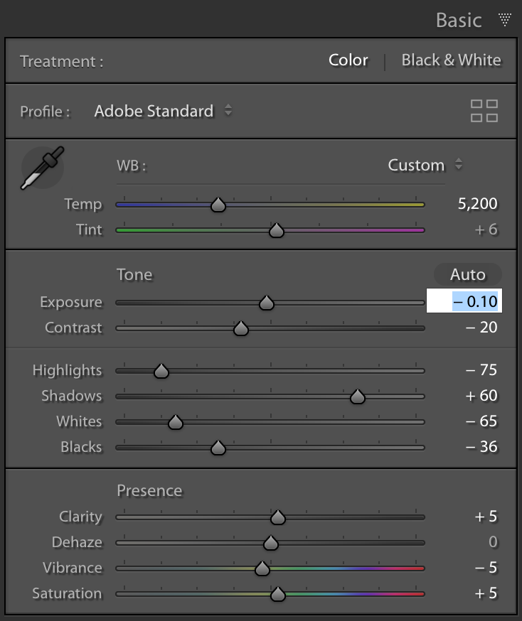
Absolute Favorite: Use your arrow keys! I shoot in Kelvin and I don’t often need to make such huge adjustments that require going from one side of a slider to the other. So instead, I click on the number and then use my up and down arrow keys to make quick and simple micro adjustments. For most edits (highlights, contrast, shadows) the arrow key moves it one number at a time. For exposure, it moves it .10 at a time! And for temperature, the arrow keys adjust it by 50 at a time. Try it! It’s simple and easy and doesn’t require micro movements to perfectly adjust a tiny slider bar! Just the up and down arrow keys. You can hold those keys to make larger adjustments quickly, and then tune those adjustment with ease.
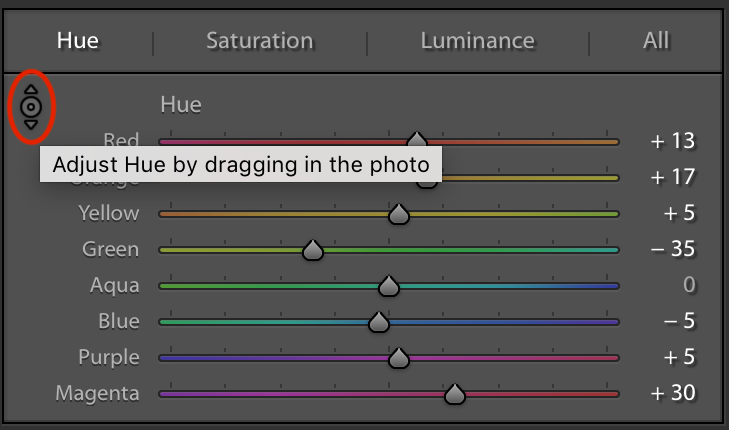
No. 06 - HSL Slider Droplet
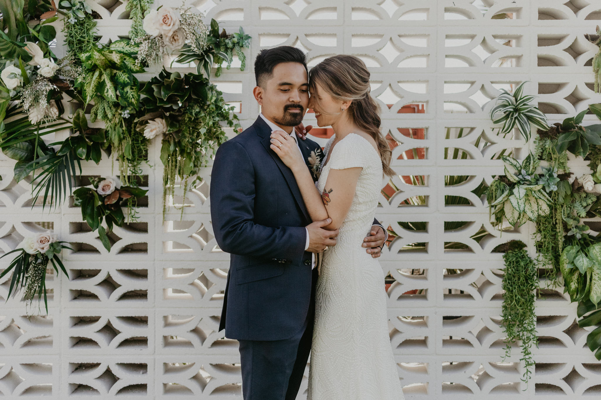
Pay attention to your colors, sweet friends! Make sure you’re editing with intention. Do you want the skin to have certain tones? Are the greens muted? Are the blues pushed to more of a teal tone? What look are you going for and why? These questions are important to me and I think about them every time I edit! And my biggest concern is creating natural looking skin tones. There’s nothing that takes me out of an image more than incorrect skin tones, greens that don’t look natural and white wedding dresses that no longer look white due to presets and incorrect color grading. Don’t fabricate the memory for your clients. Document and deliver a story that accurately represents their experience!

My first step is typically using the color sliders to find accurate tones that match their true look. With most presets, that usually means adjusting the oranges for skin tone, the greens for foliage, the blue for sky or shadows and the yellows for balancing sunlight. I also will play with the “white” slider in the basic module to ensure the dress looks accurate. It’s a delicate dance between adjusting highlights (especially in harsh light situations) adjusting the whites and keeping an accurate white balance. Practice helps! Don’t avoid it.
But for when colors are being super stubborn, I use the HSL slider droplet. This lets me choose any of the three offered HSL edits which are (quite literally) Hue, Saturation and Luminance. Pick your HSL poison and then click on the droplet icon (shown below). Click on the image in the exact location you’re wanting to change. The orange in the skin tone? One pesky overly bright pink flower in the bouquet? The exact color blue in her eyes? Click in the exact spot and drag up + down to see the adjustments!
No. 05 - Match Exposure
This one is super simple and equally as wonderful. It’s so damn useful, I don’t know what I did before I knew this existed! Yes we can match the exposure slider in the “basics'“ panel when editing an image. We can slide (or use your arrow keys!) to get the perfect exposure for your image and then sync that exposure to another image. But that’s the exact problem! You’re syncing the exposure for one photo to another photo that might not need that same exposure adjustment! You’re just looking to nail the perfect exposure for that exact scenario. So instead, to make the exposure adjustments you need for that scene, highlight the other images from that scene with inaccurate exposure, head to Settings > Match Total Exposure!

The selected and highlighted image in the middle of the film strip was the most accurate. It was barely adjusted to find the best exposure. I highlighted the surrounding images in the same scenario, went to Settings and then Match Total Exposure.
This action creates an almost perfect exposure in all the surrounding images. Small tweaks may need to be done but this is a great shortcut that was always there, but we typically overlook!
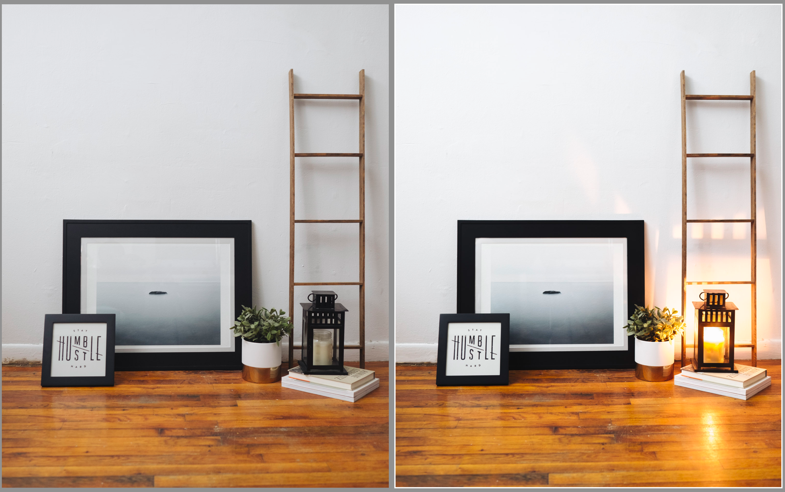
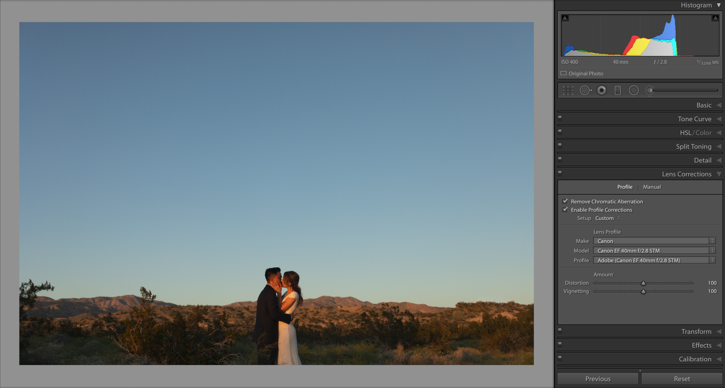
No. 04 - Lens Correction With Natural Vignette
If there’s one thing I love about owning a variety of lenses, is the different natural characteristics you start to notice in them all. For instance, the Canon 35mm 1.4 L is by far the most contrasty lens I’ve ever shot with. I love that focal length and despiiiiiise editing images shot on that particular lens. Sigma wins that battle, in my opinion, hands fucking down. But as silly as it may be… my $179 Canon 40mm 2.8 pancake lens is one of my absolute favorite. I can’t explain why, it just as an authentic feel that I love and can’t get enough of. I highly recommend it for any photographers kit. [Check it out here!] The one characteristic I absolutely love about this lens is it’s natural and gorgeous vignette. And if there’s one thing we gotta agree on, my friends, it’s that a natural vignette, from the shape of the elements that forms your magical lens, is far superior, in all aesthetic ways, to a fake vignette added after the fact. That’s just how it is and that’s how this conversation is going. Authentic, not fabricated. Done. Yes? Done. Moving on!
When editing images I took with my 40mm, there’s often times I want to add a general lens correction. 40mm isn’t that wide but in certain situations, it can feel a little distorted. So I opt for lens correction. Usually no big deal except when it’s used in automatic mode and just left to make up it’s own damn mind, it chooses incorrectly almost every time! It adds a fake white vignette, created through the mathematic process that fixes your lenses distortion, to try and balance the natural vignette on the image. Gross. This is how we fix that!
Under Lens Correction, feel free to choose auto. It’s quite smart and can read the metadata of the image to determine the exact camera body and lens used to take the image in question. Typically it’s quite close in regards to fixing distortion. But now bring back my yummy vignette! I use the “vignette” slider under the lens correction sliders, to adjust the vignette back to my liking. Thus fixing any awkward distortion weirdness but keeping the lovely natural vignette created by the wonderfully cheap little lens. Awesome sauce.
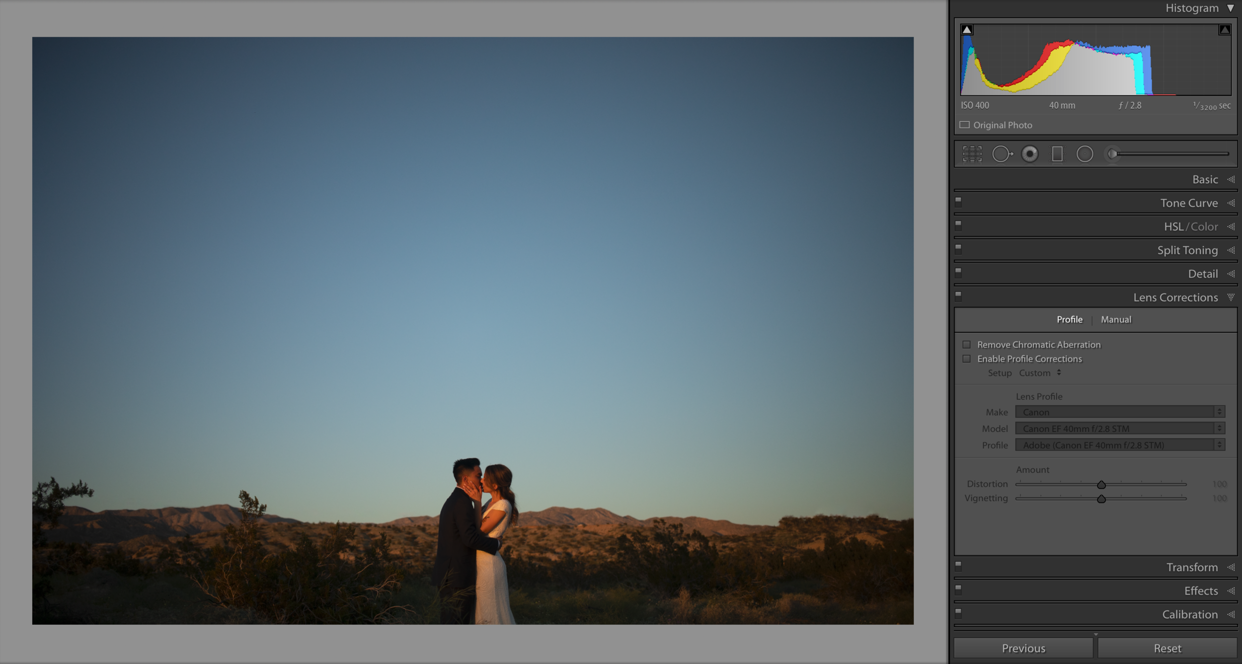
Here’s the image, straight out of camera, with a natural vignette and no current lens correction. The ends of the horizon are bowed upwards due to the focal length, the distance of the background and the angle I’m shooting at. To fix the bowing and create a straight horizon, let’s enable our profile corrections and ALWAYS remove chromatic aberration.
Here’s the same image with the lens corrections designed for the Canon 40mm 2.8! The viewers eye is no long drawn to the center in the same manner as it was with the natural vignette present. So let’s use the vignette slider under the profile information to adjust that (left for darker vignette and right for brighter… which you shouldn’t really ever be using, just being honest!).
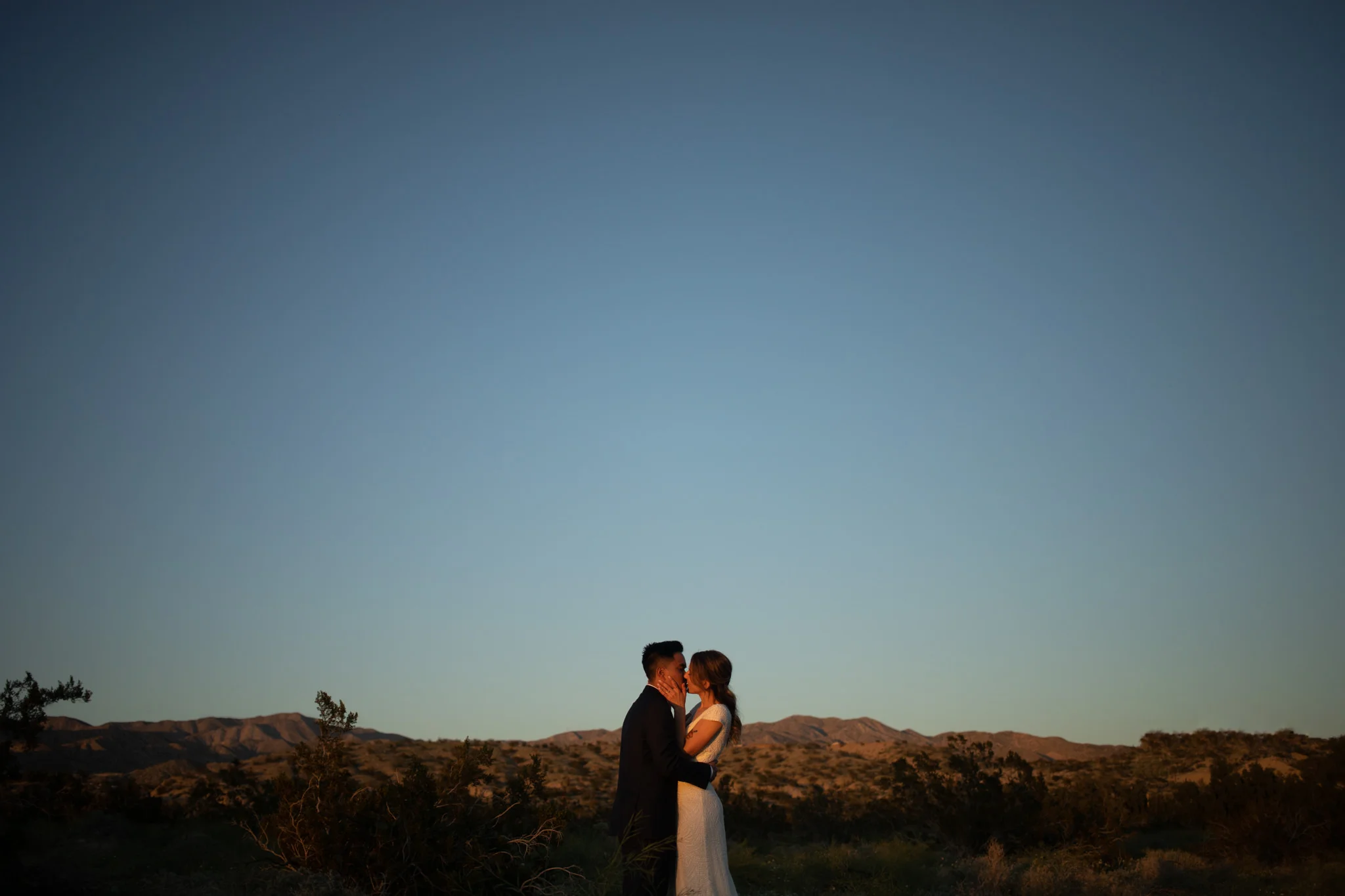
Here’s the image with the natural vignette added back after using profile corrections to even out the horizon.
No. 03 - Sharpening Mask
This is a good one. Okay so you want to have those super crisp and perfectly sharp images right? Three things. One is the proper export settings for wherever the image is ending up. I’ll get into that in a future blog or ebook! The second is nailing your focus when shooting. That little tidbit of information is included in our workshop curriculum. But the sharp look you’re trying to achieve is also affected by your editing process.
Your first and biggest mistake is simply adding sharpening to your image in the detail panel in your develop module. You know the one, we’re all guilty of abusing it every once and while. It can also be seen below in the example image, on the right side of the screenshot.
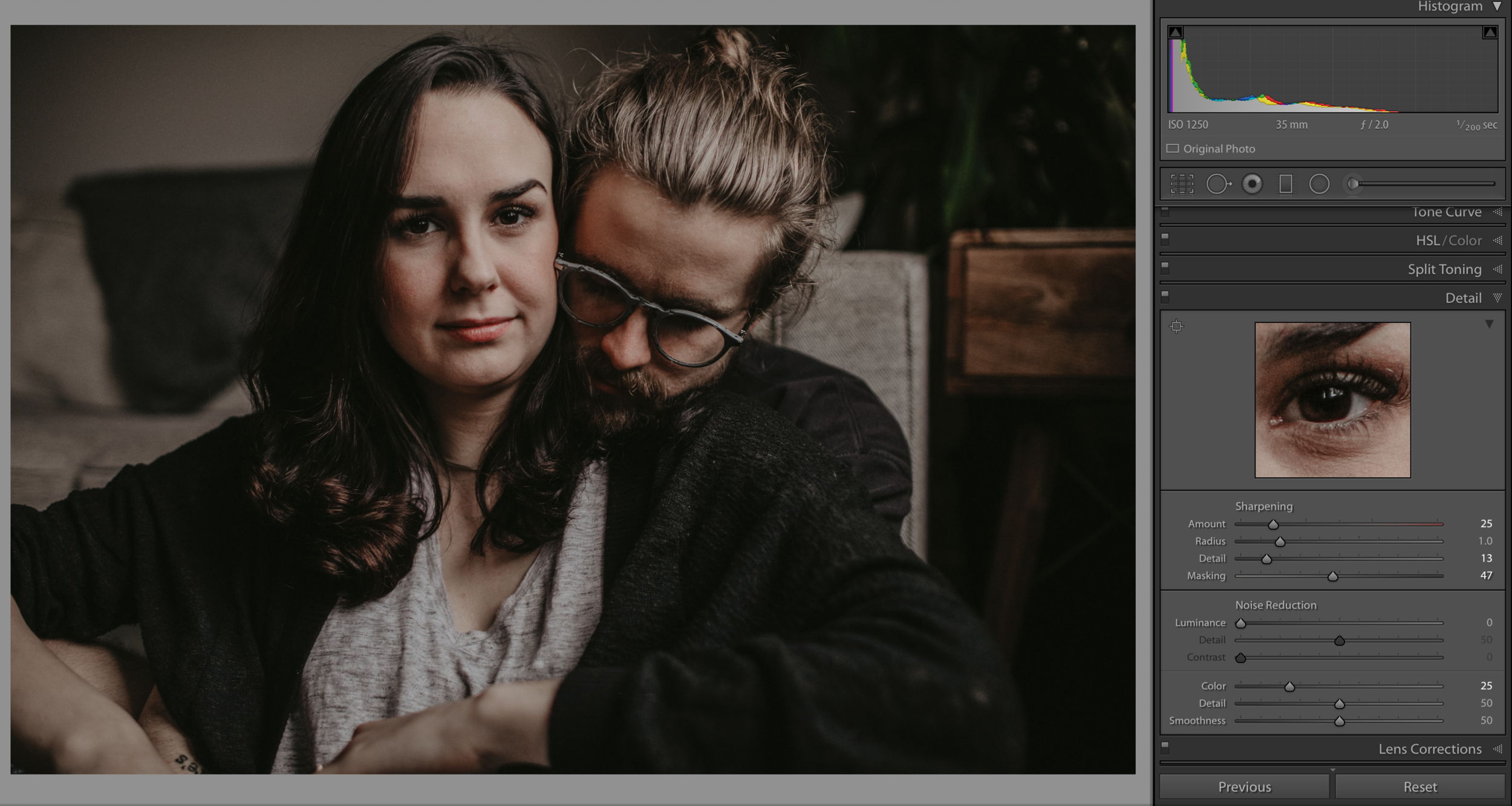
Probably the most common mistake is moving that sharpening slider up and not know what exactly you’re affecting. I chose this photo as an example for a reason. Both Victoria and Chris are in focus. The entire shoot was for them, so of course their presence was the main focus of the shoot. To subconsciously convey the importance of the couple, and force the viewer to focus on them, always consider where your sharpest point is. If you can, aim for the eye closest to you. That’s the typical rule of thumb (and yes, rules are made to be broken!). But in this case, Victoria’s eyes are sharp and Christopher’s glasses and the light hitting the top of his hair is also in focus and looking quite lovely. Jeeeebus I love that natural window light. Okay! So, they’re in focus, is basically what I’m blabbering on about. So why would I want to add general sharpening to this whole image? Forcing the mathematical sharpening algorithm of Lightroom Land to add some funky, crunchy and fake sharpening on top of the soft background which is purposefully blurred away, due to my aperture and creative decisions. Stop adding that funky crunchy sharpening and utilize sharpening masking!
Starting from the top of the sharpening options. There’s the close up example of the image, specifically her eye because that’s what ultimately matters the most. Next, sharpening amount. I’m usually between 25 and 50. The radius and detail are determining what is happening in the space around the edges being sharpened. (Sharpening looks for edges and enhances them). Radius is how wide from the edges the effect can be scene and the detail will define the clarity of detail that can be seen. Next is masking! Magical masking. This is your new best friend.
Click + Hold Option (Mac) or Alt (Windows) and then begin moving that masking slider to the right. You’ll notice the image goes into Etch-A-Sketch mode and you can see exactly what edge you’re affecting and to what effect. Keep moving that slider until only the edges of what matter’s most are being affected by the sharpening. Ta-Da! The best mask Victoria has ever worn. Probably not, it actually looks totally creepy, but it’s still an amazing editing tool.
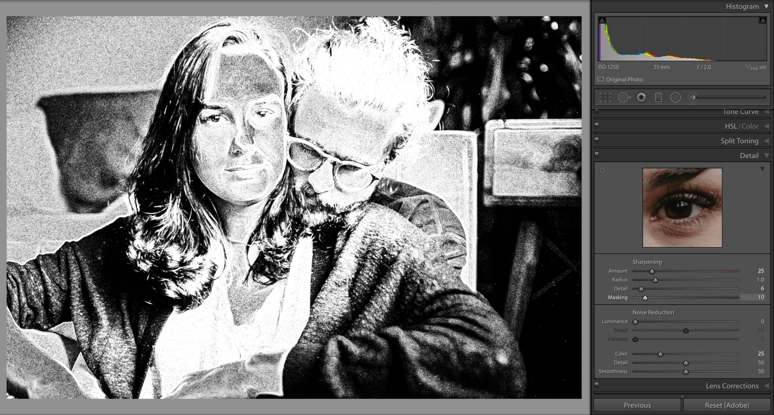
This is what your mask looks like before you begin narrowing down the area of your image affected by your sharpening mask. This is with the mask set at 05. As you can tell, even the soft, out of focus elements in the background are trying to be forced into focus. We don’t want those elements sharp, so let’s increase the mask, which narrows down the area being affected.
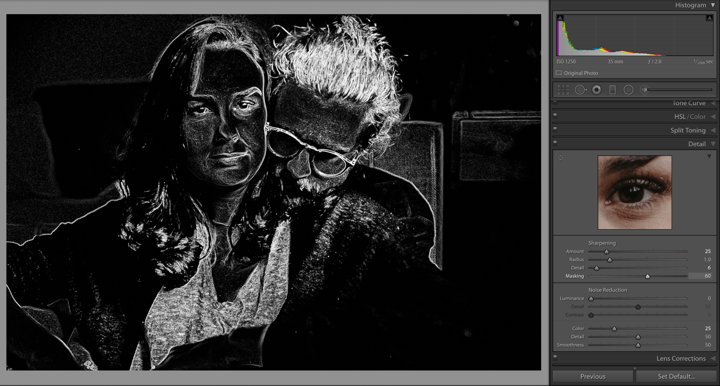
This shows the image sharpening mask set at 60! The things in the background are no longer being affected like they were, and I can continue helping the viewer focus on the main importance in the image - the couple! The background should only add to the energy of the image, it should never distract the viewer.
No. 02 - Range Masking
Okay so these last few here are all things I wish more people knew about! This section is dealing with the same masking concept as above, except it’s used to control the edits made from brushing! When I say brush, I’m referring to three different editing tools - the adjustment brush, radial filter and gradient filter (as seen below).
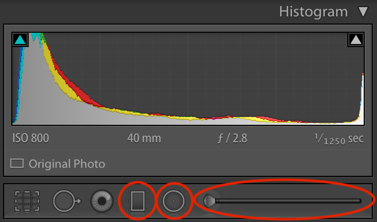
Gradient Filter, Radial Filter, and the Adjustment Brush
These three tools are what we use to make selective edits. It’s how we edit precisely what we’re intending to edit, instead of allowing wide general edits to ruin our images! This is a great start to taking control of your image. But each of these tools can be tuned to be even more precise by using their masking system, like we saw with sharpening.
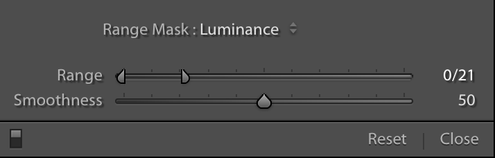
Welcome to the world of Luminance and Color Masking with Range Masking!
Luminance Masking: Affects (within the chosen area) certain LIGHT.
Color Masking: Affects (within the chosen area) certain COLORS.
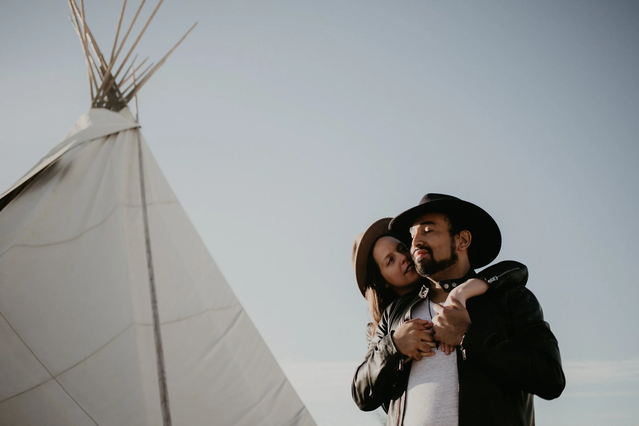
So we’re using this image the sweet Donielle and Marcel as an example because this photo was taken with some strong desert sun hitting them from the East and create deep shadows on the opposing side. I don’t want to necessarily take an adjustment brush and try to bring up the shadows in just the dark areas. For one, I’d be taking quite a bit of time brushing in JUST the shadows on Donielle and Marcel because honestly, these details matter! Nothing screams amateur like the halo affect created by a generic brush, pulling up the shadows, and sloppily brushing around the couple, creating a halo effect around them. By pressing Option (Mac) or Alt (Windows), you get a ( — ) brush that allows you to erase parts of brush strokes. And by pressing “O” you can actually see the brush strokes you’re adding. They show as a color now! You can erase brush strokes a little easier when you can see the affected area.
But the adjustment brush is not what I would use in this scenario. I would use the radial filter, place it around Donielle and Marcel, press “O” to see what I’m affecting, set it to inverse so it affects the inside of the shape instead of the outside, up my shadows, and choose to use Luminance Masking! I’ll adjust the masking slider so it’s only affecting the dark (or lack of) light in the chosen area! So it will only affect the shadowed areas inside of the radial filter. And here’s what all that word vomit looks like! Step by step.
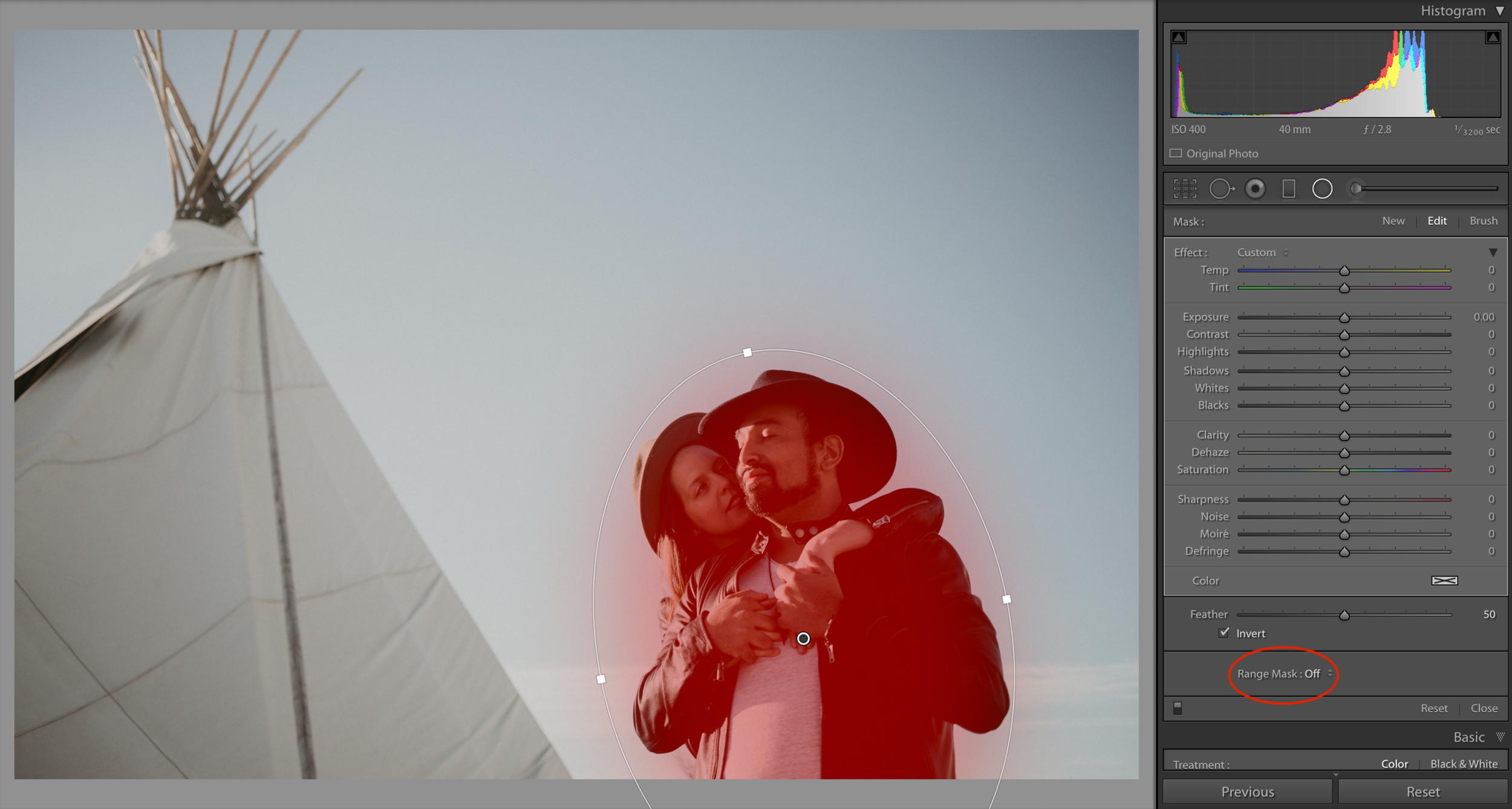
In the image above, you see the radial filter I added and adjusted around them. I pressed “O” to see the affected area (displayed in red). I then inverted the selection (checkbox at the very bottom of the slider list) so it was affecting the inside of the shape instead of the outside. But by looking at the red, I can tell any adjustment I make will affect a whole blob like area around them! I just want to affect the shadows on them. So next I will use the drop down menu next to “Range Masking” and choose “Luminance” since I’m looking to adjust a section defined by it’s light, not its color. That drop down in circled in the image above.
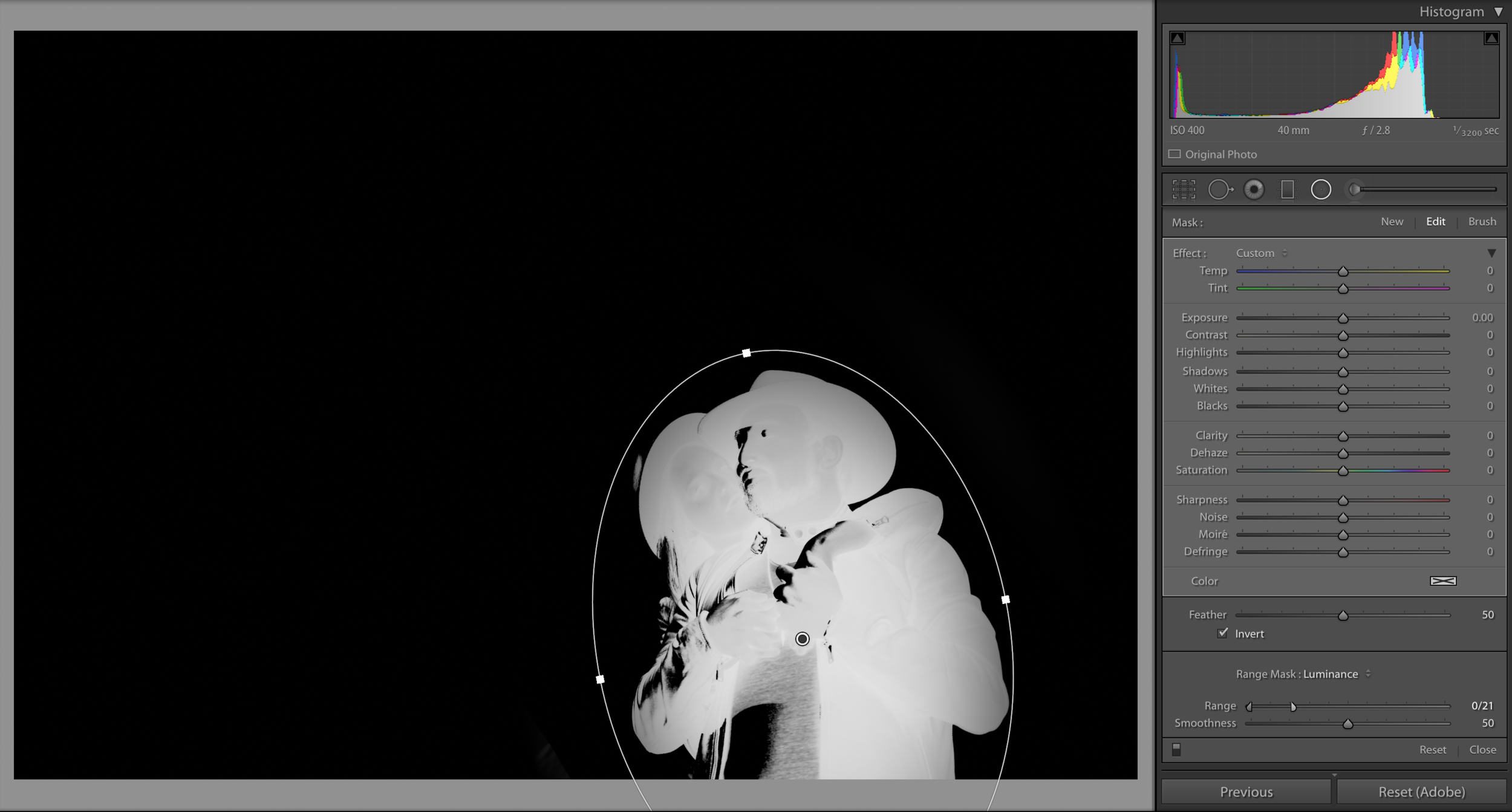
Okay! So same concept as the last shortcut, Sharpening Masks! By holding Option (Mac) or Alt (Windows) I can see, in high tech 2019 etch-a-sketch form, what area is being affected once I start to tune my mask to the adjustments I need. That top image shows what my Luminance sliders look like in my Range Mask!
Top Image: My luminance sliders is brought down towards the bottom of that slide. It’s affecting all light in the bottom 0 to 21 percent range of the image. So all the dark stuff. If I only wanted to affect the highlighted areas, I’d move the sliders they were affecting the percentages somewhere between 70 and 100.
Bottom Image: The bottom etch-a-sketch image shows those bottom lumens being tuned into. If you notice the white parts (that’s the active mask) is only showing up where the shadows are, in that radial filter! So now, check this out! That red mask we saw before will now perfectly dialed in to only be affecting the shadows!
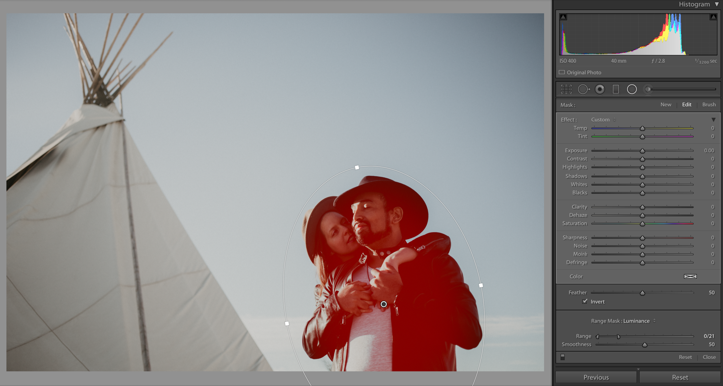
And just like hat, the blob is gone! No more halo affect from your brushes! No more tedious brushing tiny brush stokes around the areas you need to affecting or spending all afternoon erasing the brush marks that create evil halos! Range Making is the bees knees! Practice with this technique because it will completely change how you edit!
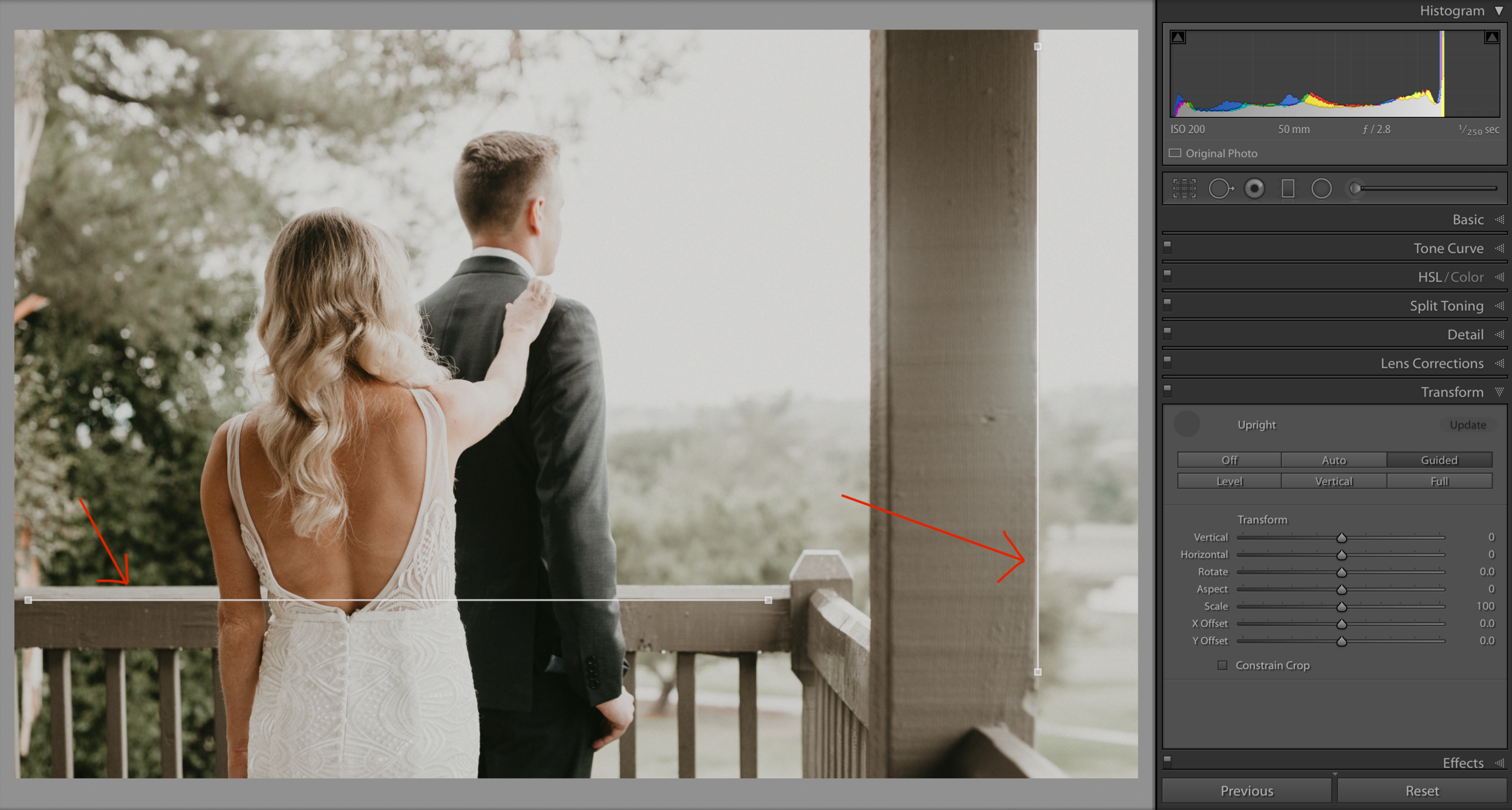
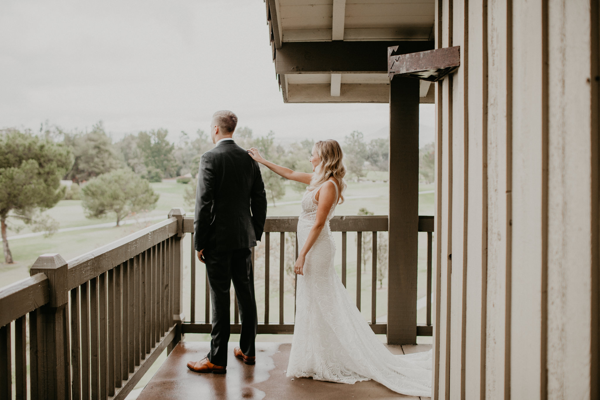
No. 01 - Guided Upright
Literally my favorite tool on Lightroom. This simple to use system helps avoid all the awkwardness that can be created by funky angles, linear shapes and uneven lines. This is super common when photographing architecture, since it’s usually based solely on linear and parallel lines. Unless you’re shooting it perfectly face-on, the lines won’t always look straight. Perspective affects the way we perceive lines and the more odd of an angle we find ourselves in, the more odd the lines become. The best way to explain is with some photographs!
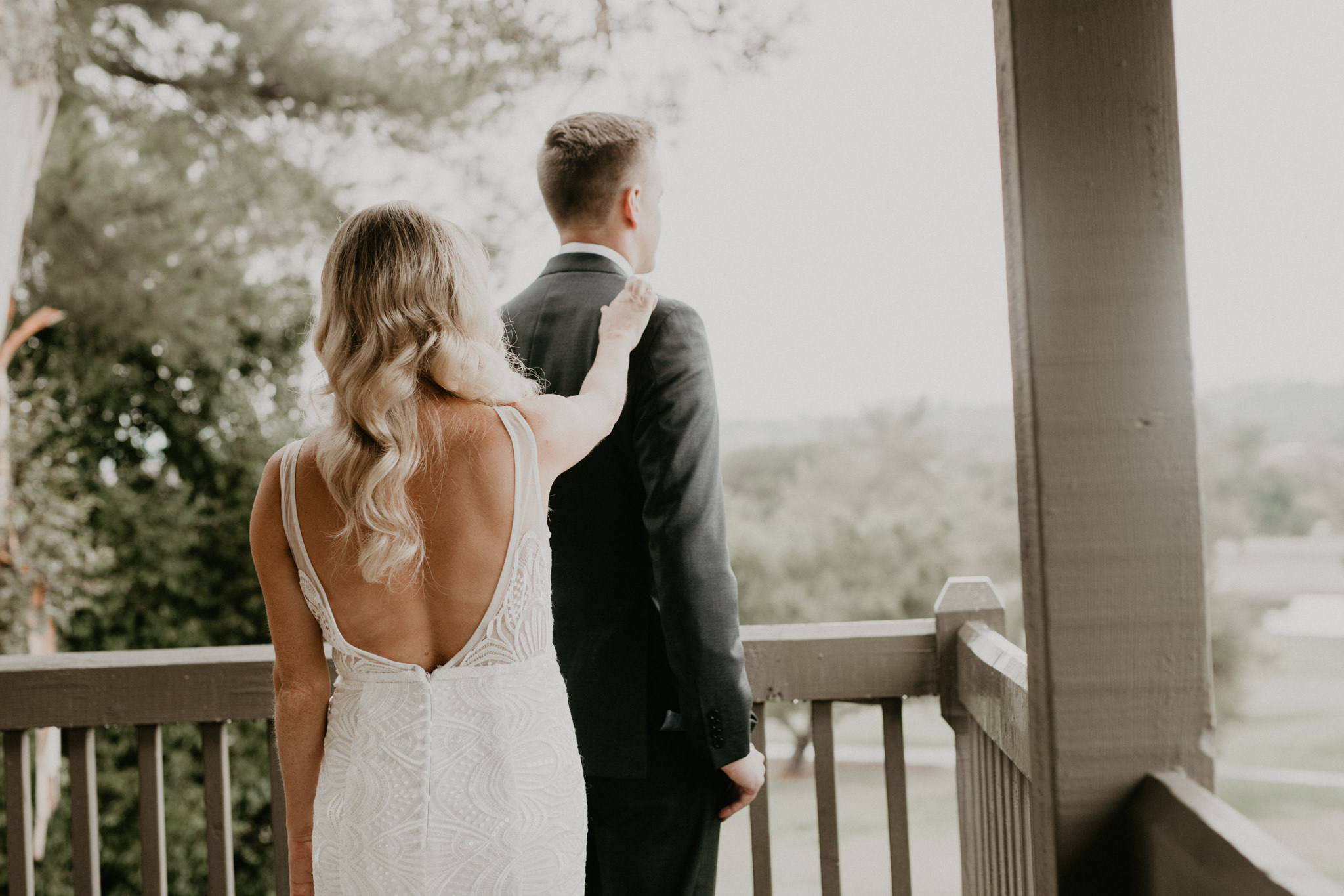
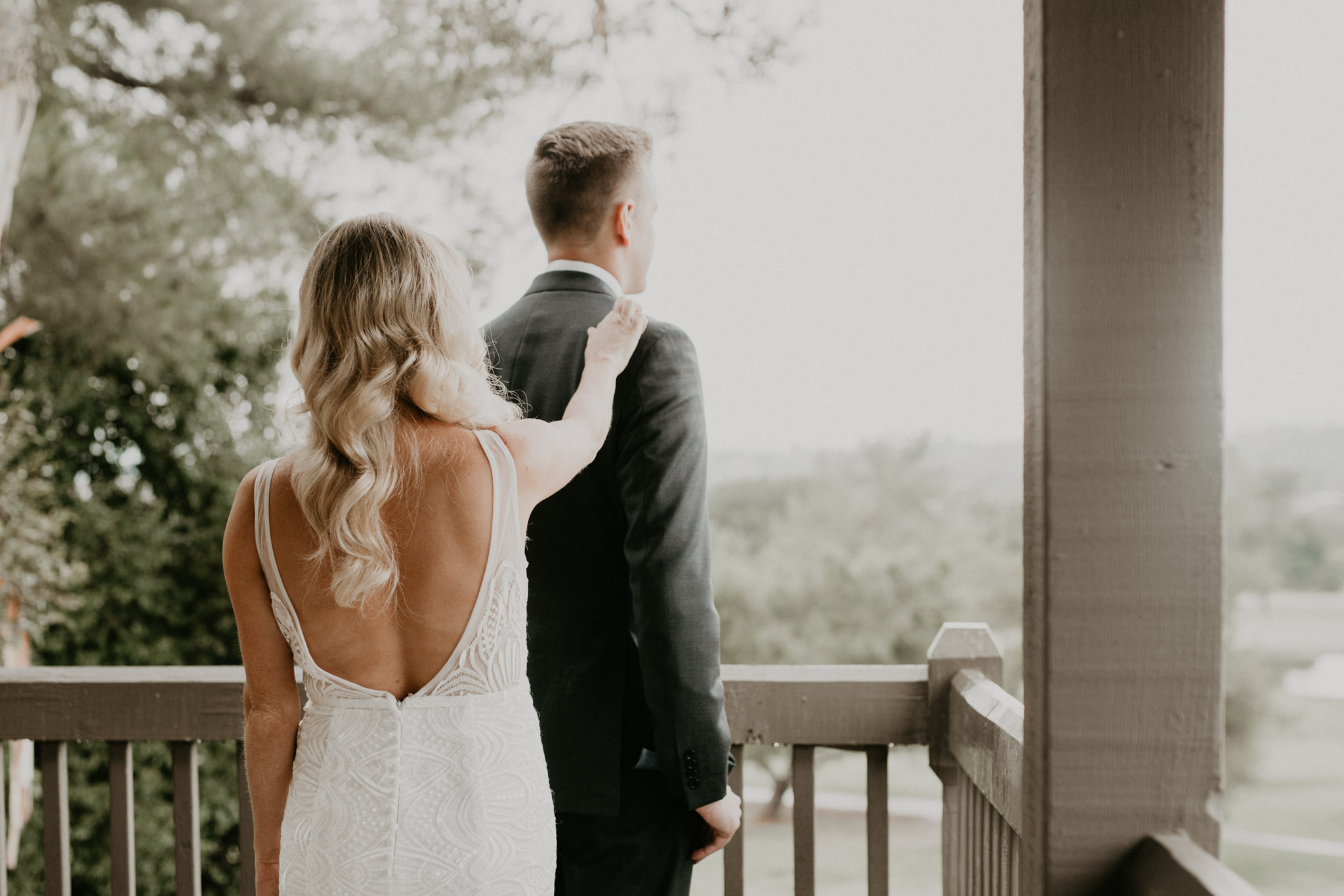
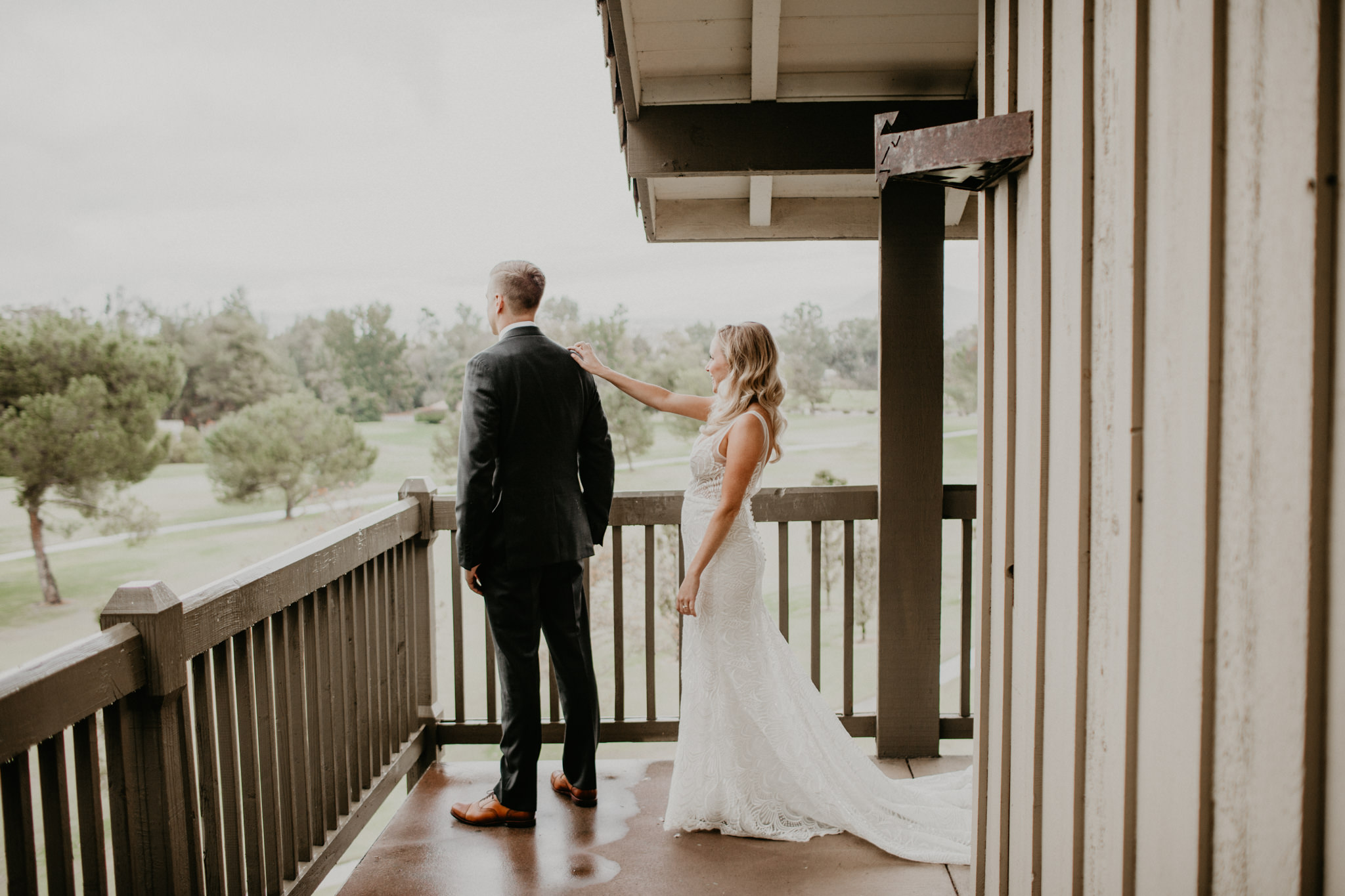
Below are images of my lovely friend and past bride, Caitlin. She was a freaking champ because even though it decided to downpour on her wedding, in southern California (what?), we still had a beautiful first look on the balcony of her bridal suite. Gotta roll with the punches. The sky was a giant soft-box, thanks to the clouds, so the whole scene is actually quite lovely! But the balcony was nothing but geometric lines! Everywhere! The sides of the building, the floor, the ceilings, the railings, the beams! So many lines and the angles were all sorts of wonky. On such tiny balcony, with my husband shooting as well, we ourselves in odd stances or positions. Unique perspectives are important, but I still always consider how the viewer will be affected by the image. If the lines and geometry are all sorts of weird, it will affect them on a subconscious level and the image won’t resonate as deeply with them. Let’s avoid that at all costs.
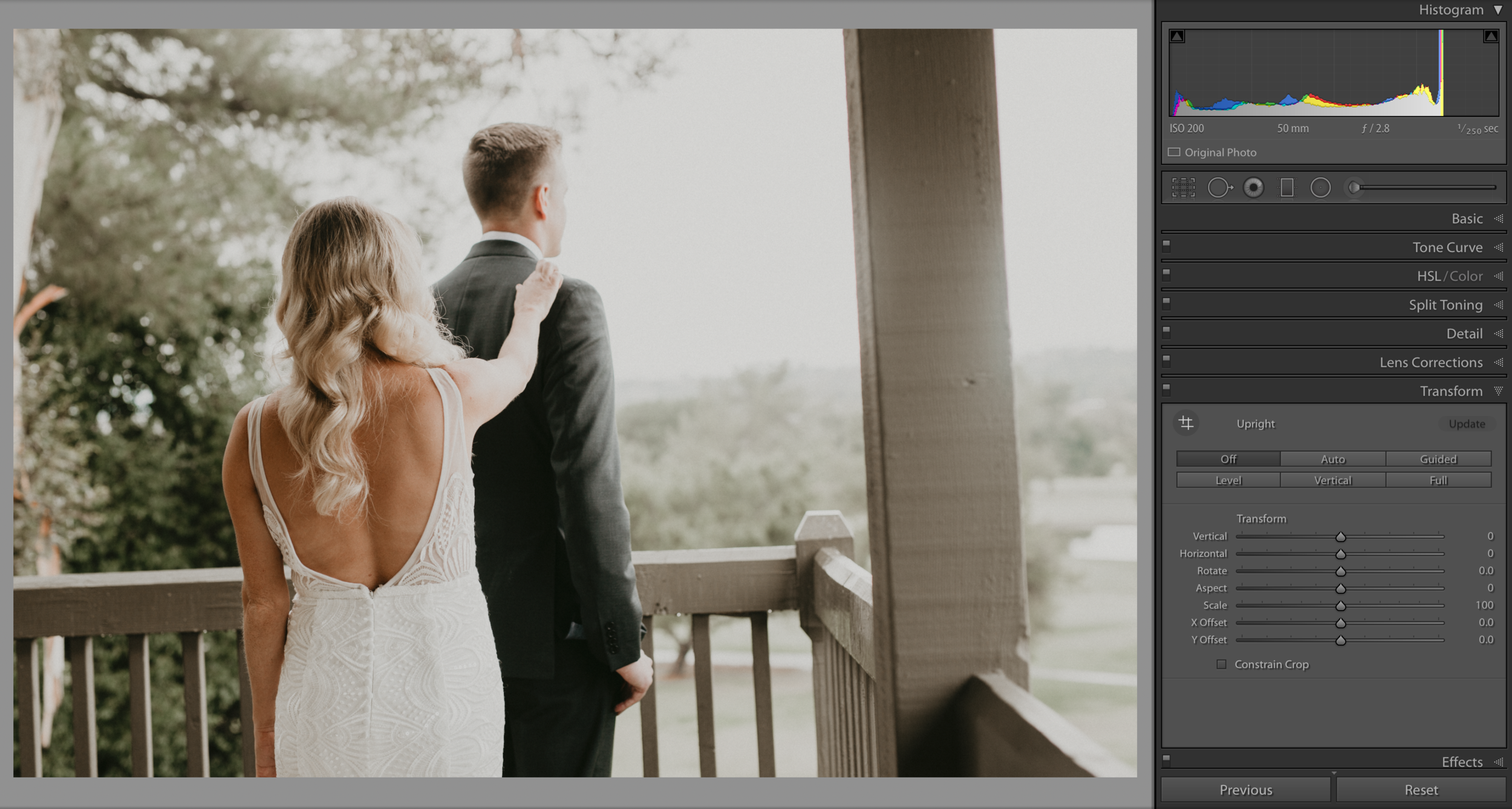
So here we are, in the “Transform” section of our editing tools. The image above is a super cute moment and needs to be included in their gallery, but all those lines need to be ironed out so the viewer, and my clients, can enjoy this image to it’s fullest. I can sit here and try tweaking my horizon line and the lens distortion, or I can utilize transform tool! There’s even an “auto” option when you need it! But I enjoy doing it by hand. And here’s how!
The transform tool allows you to lay up to four lines! There’s even a loop (magnification) that comes up when you drop the starting and ending point to your line. Get it as accurate as possible, because once you place at least two lines, Lightroom takes them and forces them straight. Basically you’re telling it, “hey Lightroom, I fucked up a little… these are the lines that are supposed to be perceived as straight”. And just like that, Lightroom has your back and will correct your image to display the proper perspective! Yay for happy eyeballs! The image below shows that I put one line along the top railing (left to right) and alongside the beam (up and down).
And it’s just that simple. Which is why I love this tool so much. I seriously find a reason to use it all the time, to make little tweaks here and there! I like to ensure the viewing experience is as enjoyable as possible, and that means double checking that there’s no weird angles or wonky perspective what will ruin it for my clients and future clients seeing the image online. Below are some examples of before and after using the transform tool! I seriously use it all the time, and here’s proof!
YAY!
You made it all the way through the blog! I hope you learned something, because Lightroom can be the most amazing and versatile tool in our arsenal. Once you start learning the shortcuts and methods that make your life easier, you’ll notice your workflow starts to run a bit more fluid and you have time to devote towards other things in your life! Productivity rules! Getting shit done!
And head’s up! If you want to learn even more about Lightroom, you have to check out our workshop tour! The rest of 2019 has us on the road, teaching the necessary basics to help you create a kickass workflow and finally find confidence in your gear! You deserve that shit, so stop messing around and INVEST IN YOURSELF!
And now that I’m done shamelessly plugging our epic touring workshop (seriously, go check that shit out!).. here’s a little freebie to say THANKS and help motivate you to try new things and customize your editing experience. It doesn’t have to be tedious and miserable. Use the tools listed above and the keyboard shorts in this PDF to make your experience with Lightroom a bit more enjoyable.
Thanks for being here!
See ya at the next one.